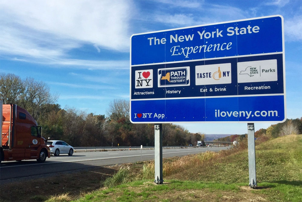
OK, I’m weighing in on the controversial “I Love New York” signs that that litter our highways. According to the Democrat & Chronicle the federal government has tried for more that three years to get the Cuomo administration to take down the signs and I agree but not for their reasons. The Federal Highway Administration points to national rules regarding advertisements on federally funded highways like the New York State Thruway. I love the “I heart NY” campaign but I am offended by this graphic implementation.
Compare the layout of a simple utilitarian 55 MPH sign to this unweildly monstrosity above. Imagine driving 55 or 65 miles per hour past this sign. Could you possibly take it in? It is a visual assault. Four logos in white boxes and all four in a horizontal dark blue box with a bold white outline. And in case the logos don’t do their job we have additional type under each. “Attractions,” “History'” “Eat & Drink'” and “Recreation.” I never would have expected New York State to have these common items. This is “The New York State Experience.” But wait, there is more to read on this sign. I see in the bottom left hand corner of the sign that there is a I Love NY app to download and over in the bottom right hand corner, just to balance out the signage, I see there is a “I Love NY” website.
The state spent 8.1 million dollars to print and erect the signs and they didn’t hire a graphic artist. This reminds me of the Post Office redesign from twenty years ago. Texting while driving is crime and throwing all this shit at you is not?
Leave a comment