As the tediousness of the pandemic threatened to dull our perceptions we found a way to reinvigorate our routine. We get out of the house before the second cup of coffee, before we have read the news and opinion pages. The streets are quiet, the dog walkers aren’t blocking the park entrance and the trails in the woods are nearly empty. While the rest of America sleeps in we have been turning in earlier and waking at dawn.
The City or County has put signs up in the park reminding visitors to stay six feet apart. The signs aren’t ugly, they don’t shout, but the message is hard to read from a distance and the tagline are hard to read when you’re on top of the signs. They make a former graphic artist wince.
There was an article in the NYT this morning about how during the Great Depression the government put thousands of artists to work under the WPA . Examples of beautiful murals, posters and signs were cited. In Trump’s world funding for the arts is non starter. So who do they hire when they want get something done? The signs in the park look like they were done by an eighth grader. Who did the Cuomo’s hideous highway signs?
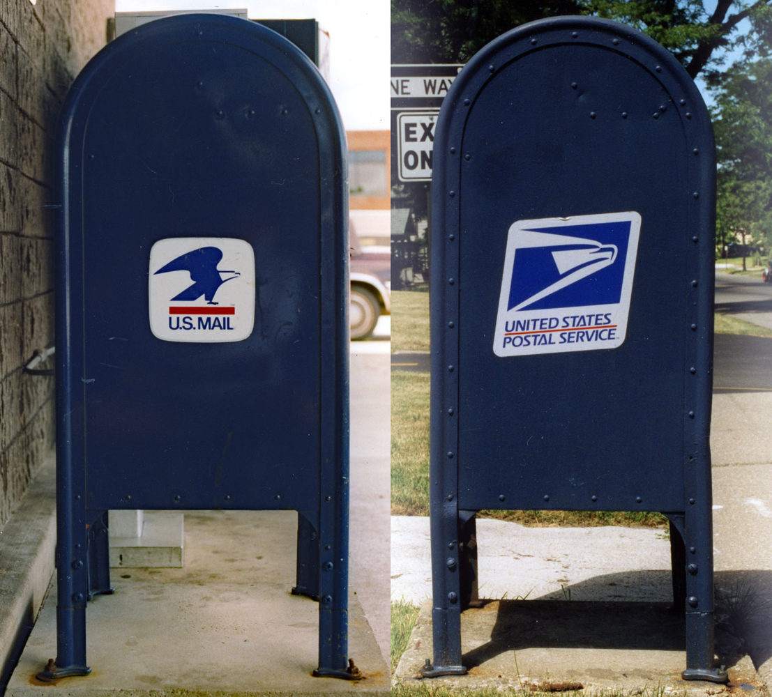
I’m still steaming about the Post Office”s move in 1999 to replace the distinctive logo that fit perfectly on the outdoor boxes with some sort of italicized, speedy like Fed Ex, abomination. The new logo makes the fifties’ styled boxes look like they’re falling over. The old logss are still there under the bigger parallelograms. Maybe we can steam them off.
Leave a comment