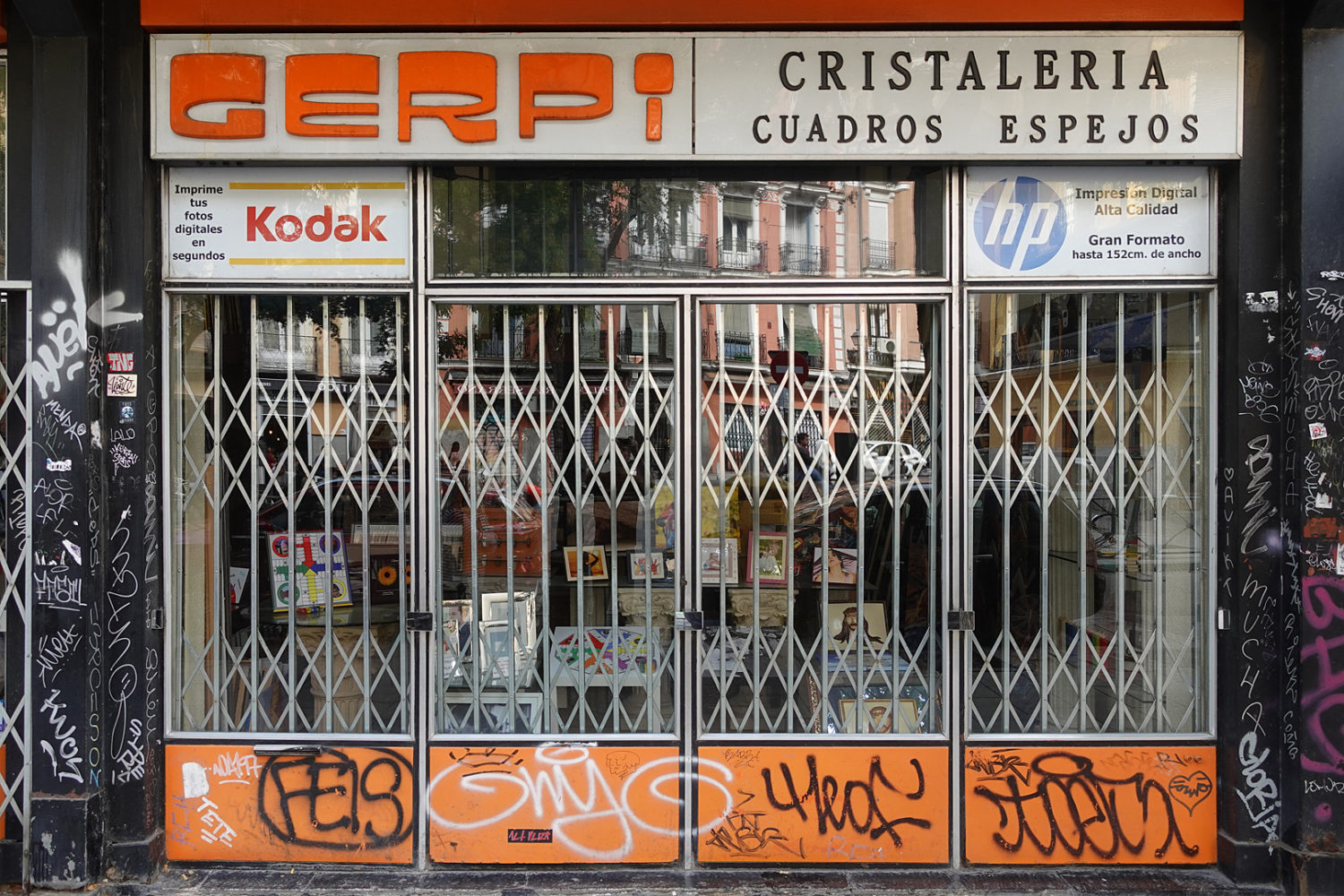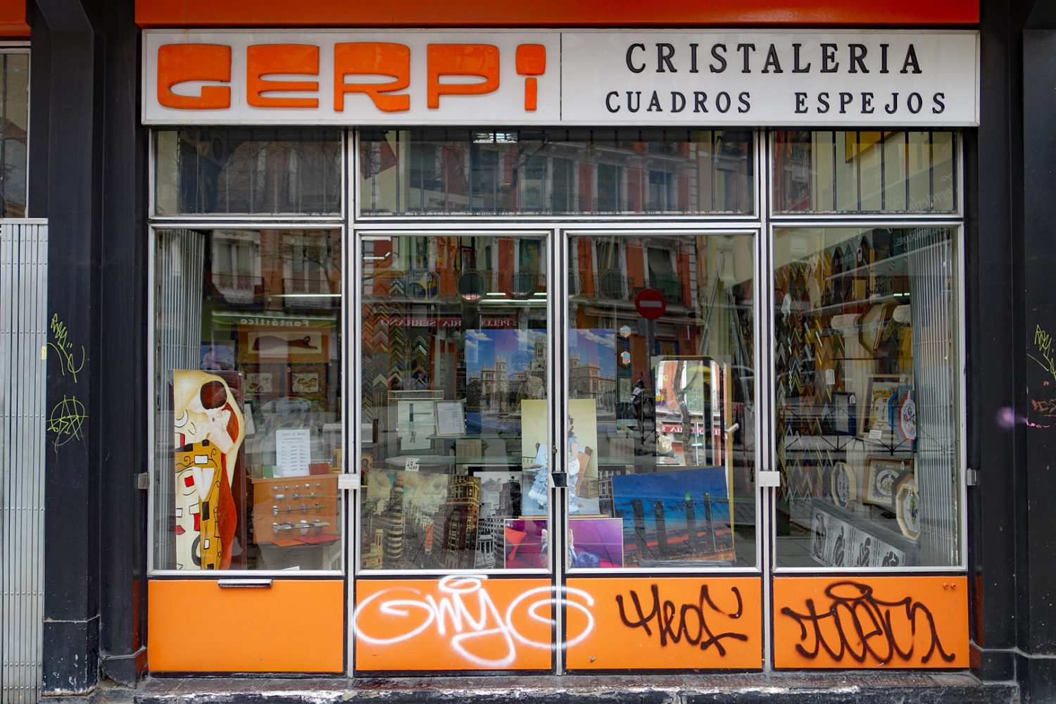
There is a neighborhood behind the Reina Sofia in Madrid called Lavapiés, a Jewish ghetto some 500 years ago, where small but hip galleries having been popping up for a few years. We usually make a point of visiting them and on the way there we came across this shop. I knew I had photographed it before (ten years ago) but I took another picture anyway. I love the lettering in their logo. You don’t see this typography very often and you never run across it in the US.
I fell in love with it the first time I saw it. It was only four letters, a sign in Barcelona that read “SEBA.” I sketched the four letters in my notebook and back home I drew what I imagined would be the dozen letters in the word, REFRIGERATOR. We’ve come across other examples of this font, always as a logo and always in Spain, and I have six or seven examples in a folder of jpegs.
I always wondered how long graffiti lasted. The three big tags on the orange panels are still here. And I thought it was Interesting that the Kodak logo made a comeback is in the newer shot.


Many contemporary foreign street photo’s I see have a Kodak sign in them. I don’t ever see Kodak signs in U.S. street pix. BUT, I do see the name Kodak on any of those cut sheets authors / artist’s use to illustrate a book or article. As long as someboby is still saying your name, you are still alive … still relevant. Kodak. John Gilmore.