I used to stop in at the Fairport pizzeria where my nephew worked, just to say hi and see how he was doing, and I was always struck by his tats, the gothic letter “D” and especially the Roc logo on his index finger. The logo, appropriated all over town these days in proud gesture, is a really healthy sign. I’ve always hated it when people bad mouth the city or the weather and I always think, “If you don’t like , why don’t you just leave,” The older I get, the more I just vocalize that thought.
Not too long ago, maybe 2000, I had a page on the Refrigerator website called “Rochester Beat” and I used a tiny version of the City logo between the words Rochester and Beat. To my surprise, the city had employees reading the Refrigerator on company time and I got an email asking to give them a call.
Dear Refrigerator,
Subject: Use of City Logo on your website
Hi, that’s our city logo on your website. Please give me a call so we can talk about it. Thanks.
Ted Capuano, Assistant to the Director, Bureau of Communications, City of Rochester, New York
I blew it off and then got another email.
Dear Refrigerator,
Subject: Re: Registered Rochester City mark on website.
Hi, This is the second time I’ve emailed you about the use of the City’s mark on refrigerator.net. Please take down the City mark from your website. If you’d like to discuss this, please feel free to contact me. Thanks.
Ted
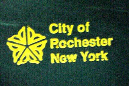
I did not want to discuss it. I took it down and put up a close-up photo of the City logo on our green trash container.
Carlie Fishgold from Rochester’s “Post” magazine had an interesting piece about the two competing designers who both claim to have come up with the logo. She finished with this line, “That the people commandeer the symbol speaks to the authenticity of Rochester’s persona . . . as the nation’s first boom town, reinvention is the spirit of our people.”
3 Comments
